A semicolon joins two sentences that are complete on their own yet related. Volume 16 of ISS Voice turns that mark into the way the whole publication is read.
ISS Voice is the annual digital newsletter of the Institute of Service Science at National Tsing Hua University. Volume 16, covering 2025, takes the semicolon as its theme and was published on the web in February 2026. I led the concept, visual design and front-end build, using React, GSAP ScrollTrigger, Three.js, Matter.js and p5.js to turn an annual issue into a single interactive scroll you can keep reading from top to bottom.
The semicolon: a turn that keeps going
In grammar, a semicolon links two independent but related clauses. It does not close a thought the way a period does, nor is it just a breath like a comma; it is a turn within continuation. I translated that idea into the structure of the site. Every faculty member, every alum and every interview is a complete sentence, and the site sets them side by side so that new meaning appears in between. When readers finish one story, they are not sent back to the contents page; they flow straight into the next. Chapters 1 through 11 form one continuous scroll that carries on the way a semicolon does.
From the opening into Chapter 1
The site opens on black with a rotating sequence of semicolons from different languages and fields: a couplet by the Tang poet Wang Bo, a haiku by Matsuo Bashō, Descartes’ “Cogito, ergo sum; Sum, ergo cogito,” even a line of assembly code, “MOV EAX, 1 ; INT 0x80.” Before any content appears, the semicolon has already been placed across cultures.
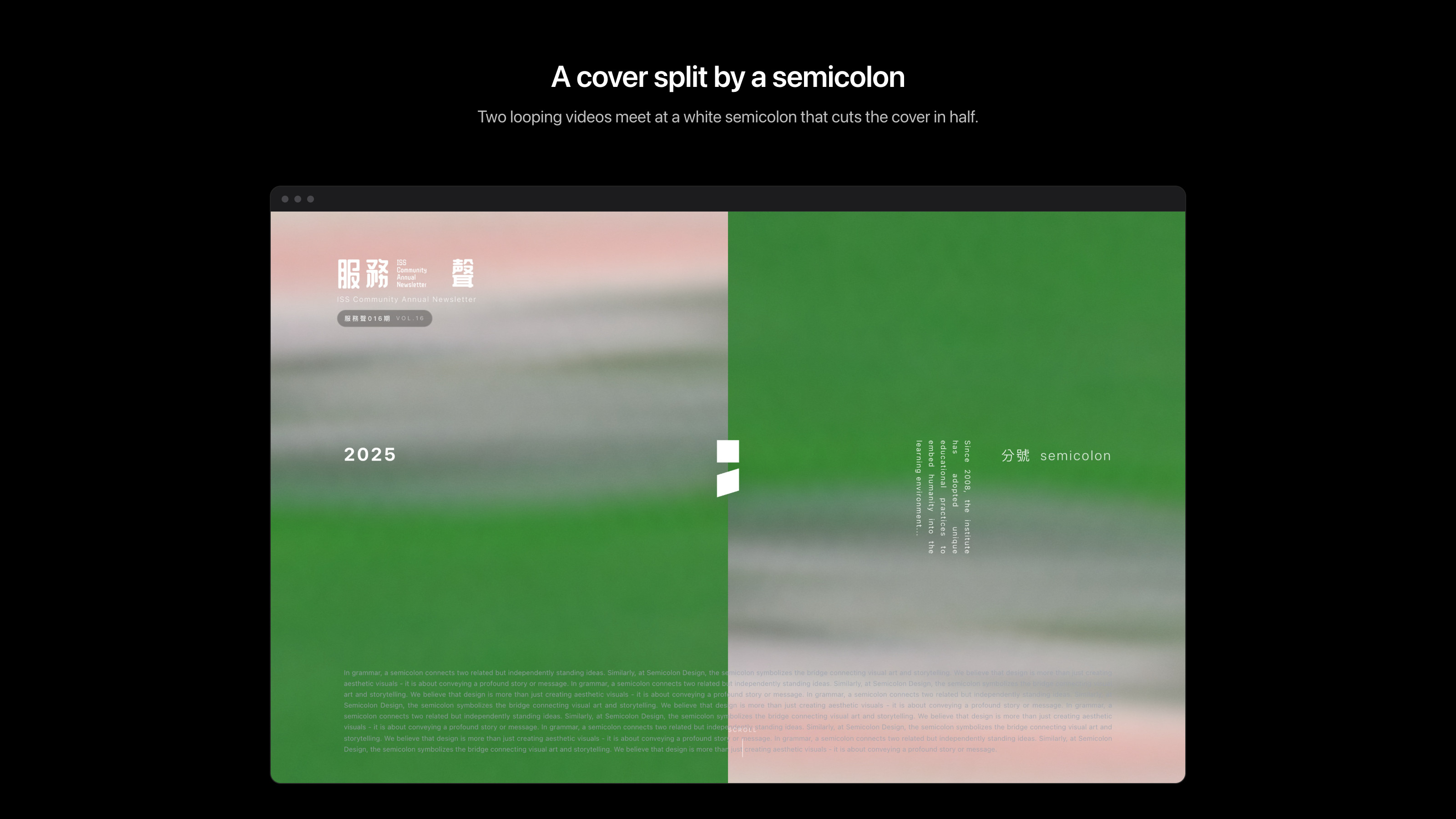
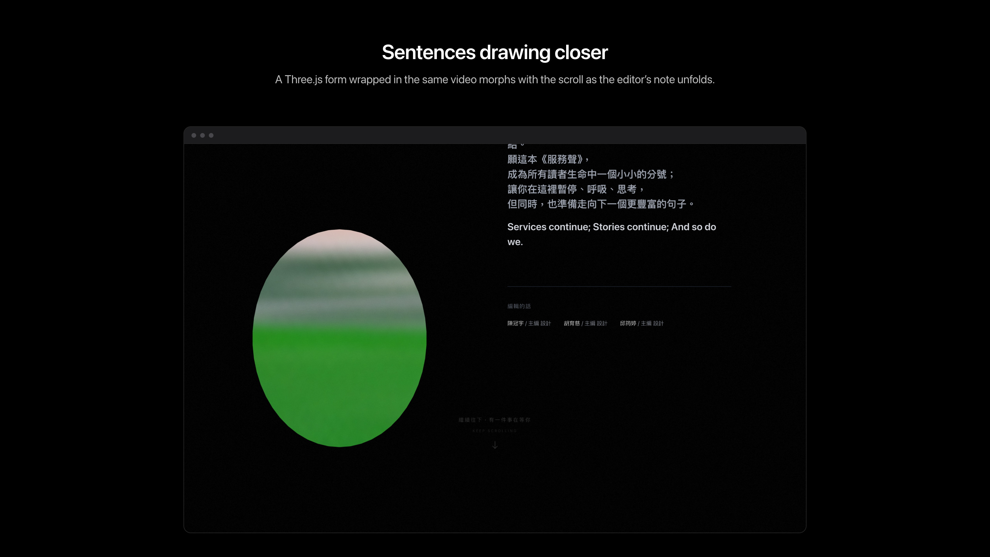
Then comes the cover. Two videos cross-fade side by side, split down the middle by a white semicolon, while vertical English text, the “VOL.16” issue label and the year 2025 form the masthead. Scrolling on, an organic Three.js form wrapped in the same video texture morphs beside the editor’s note, from an ellipse to a rounded square and then into a card, visualizing how separate sentences become more complete as they draw closer.
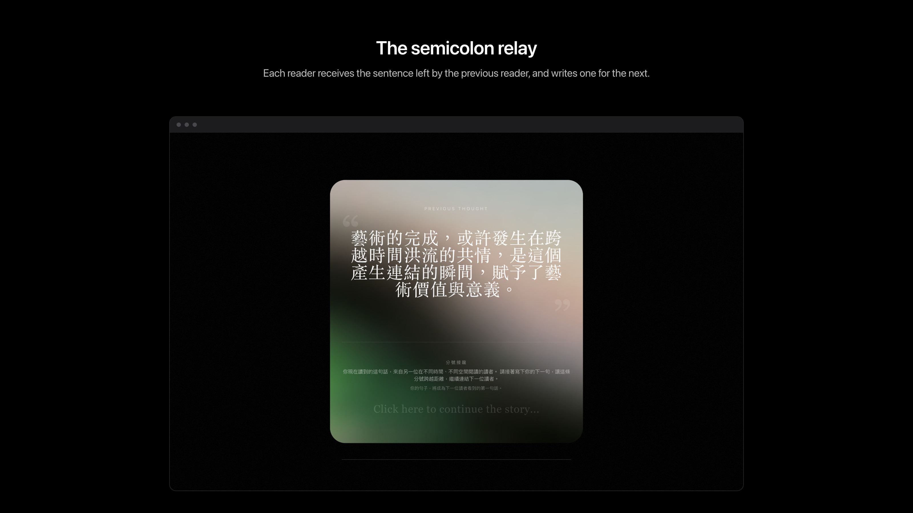
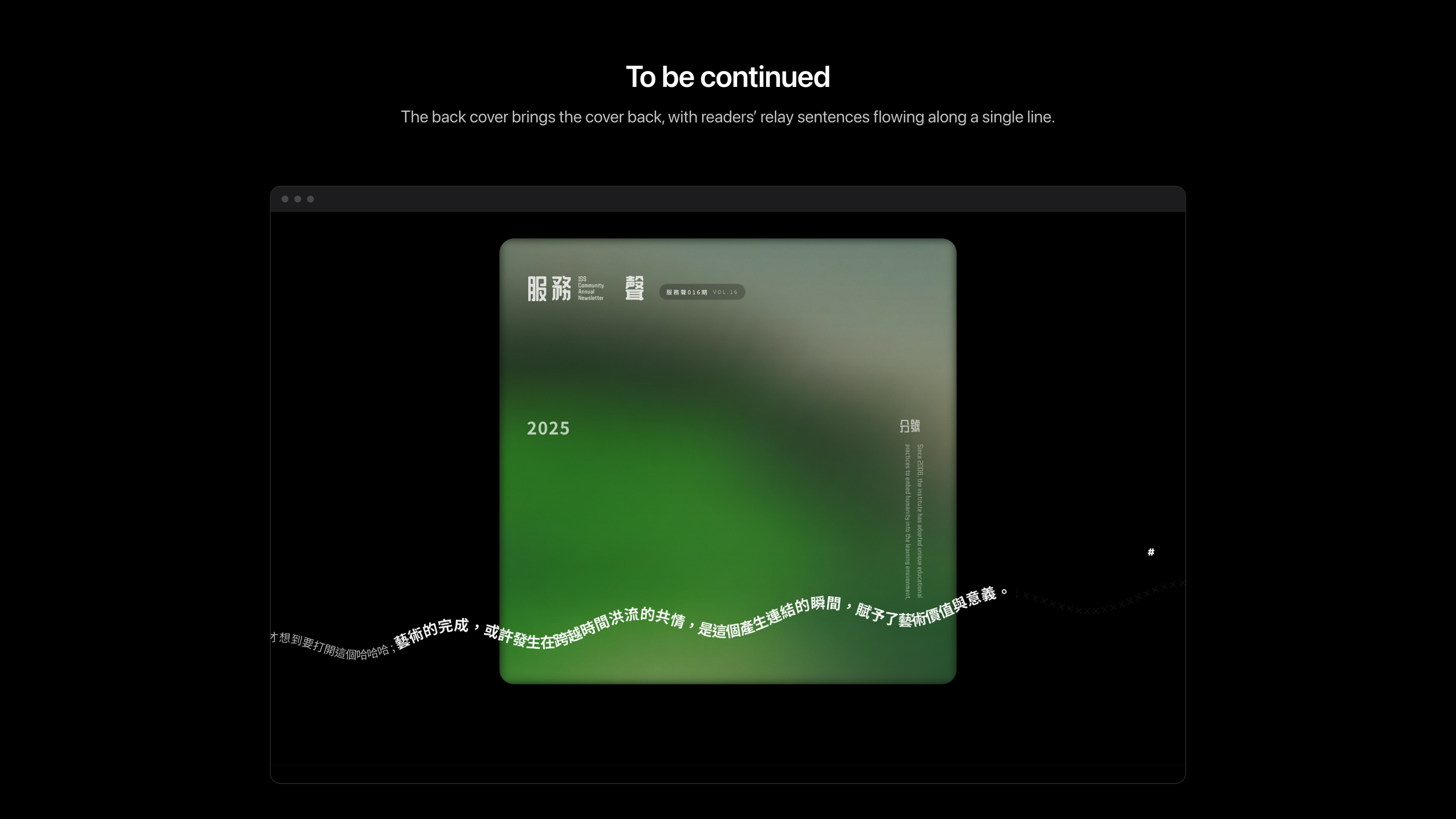
The form finally settles into a frosted-glass card: the semicolon relay. It shows a sentence left by the previous reader and invites you to write the next one. Your sentence becomes the first line the next reader sees, and it eventually appears on the back cover as well. I wanted “the semicolon connects us” to be more than a metaphor: a reader interaction that genuinely spans time.
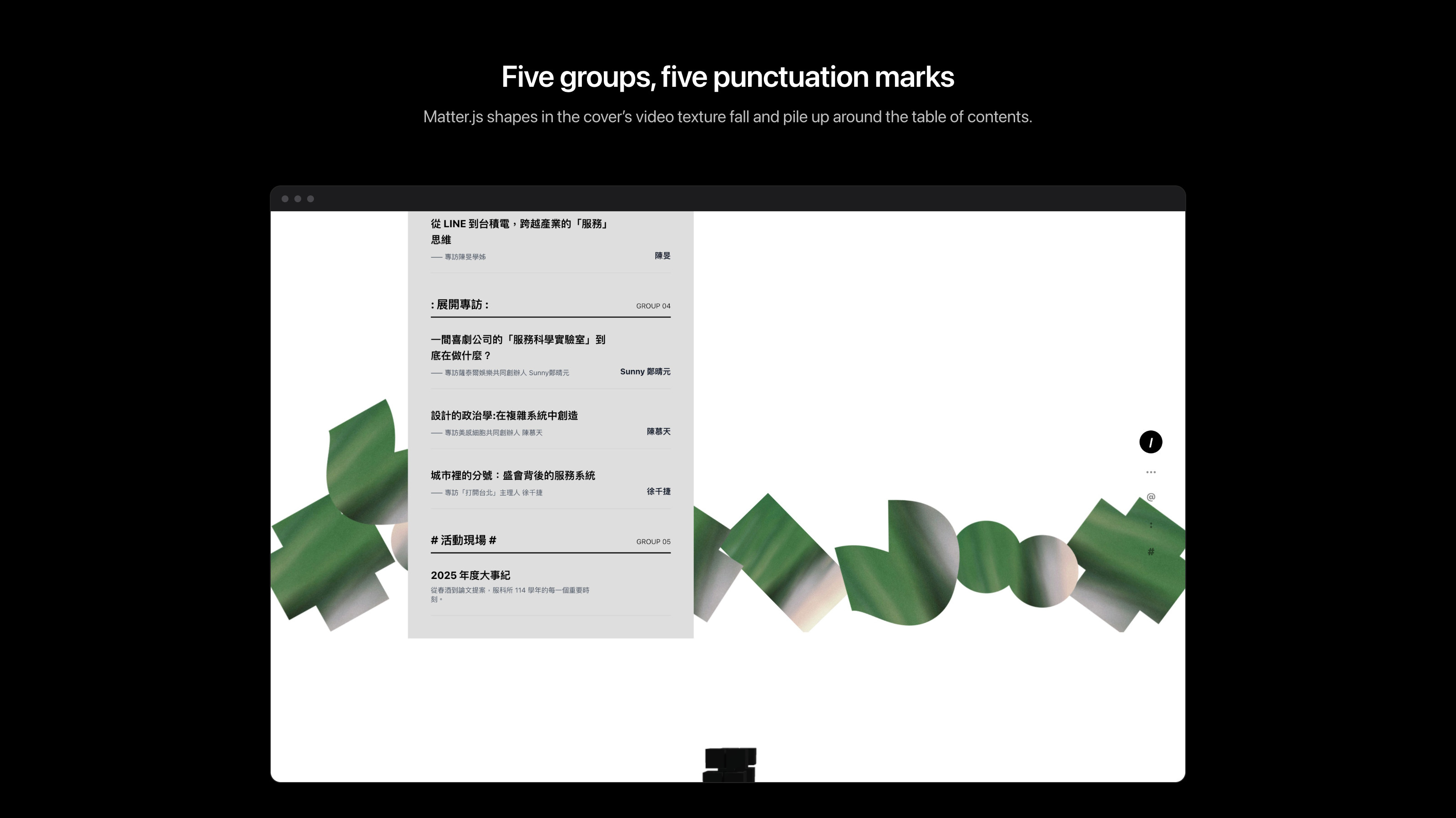
The table of contents is divided into five groups (the institute’s entrance, current students, alumni, interviews and events), each coded with a punctuation mark: /, …, @, : and #. The fixed navigation on the right is made of those same five marks, lighting up as you scroll through each group. Around the contents, circles, crosses and squares driven by Matter.js fall, collide and pile up, textured with the same video as the cover. A black 3D staircase then stretches diagonally down the page and leads readers into Chapter 1.
Inside the chapters
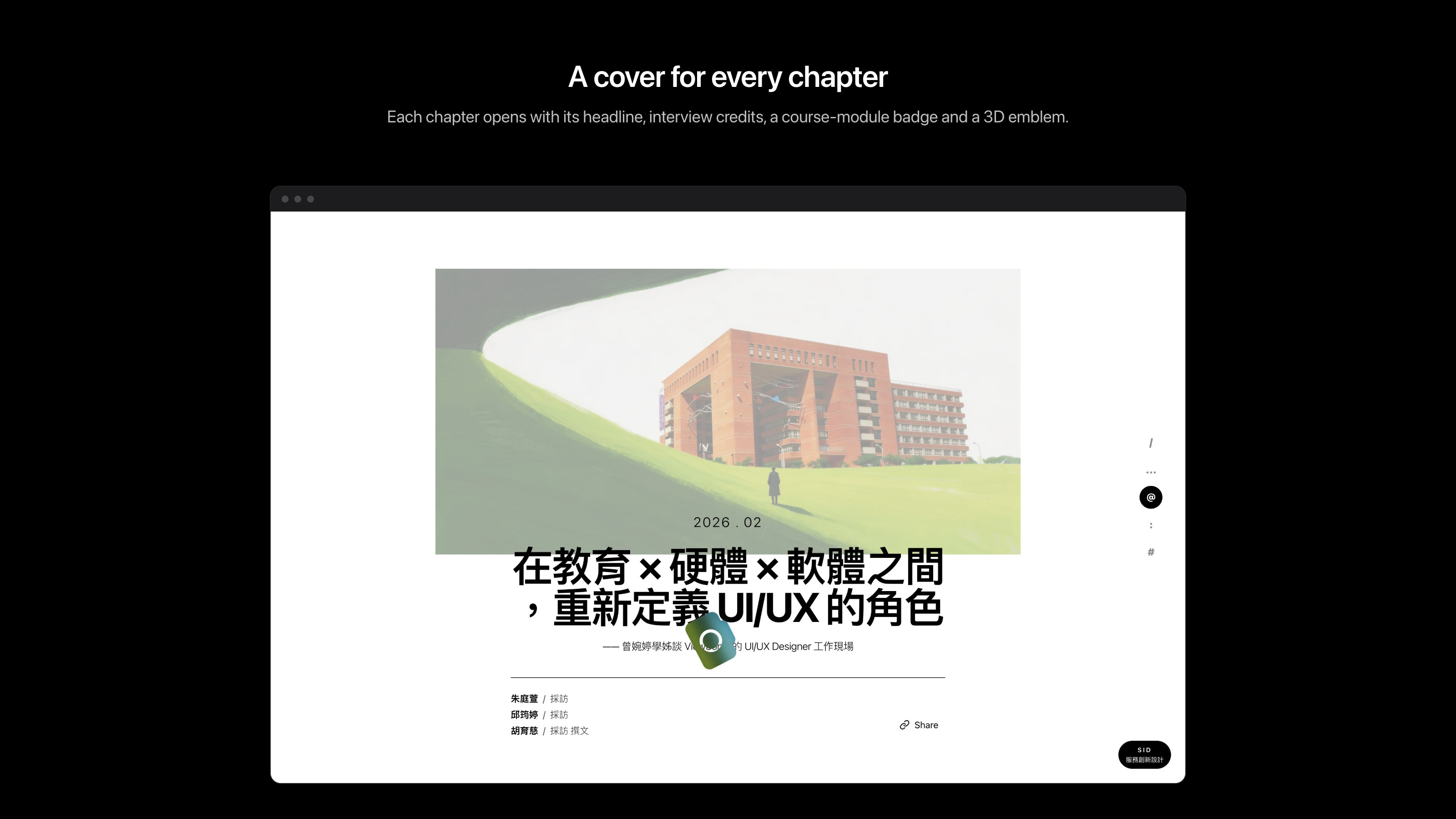
Each chapter cover sets a large headline over a campus illustration or a photo of the interviewee, followed by the interview, writing and accompanying credits and a Share button, along with a dedicated 3D object (a shell, a medal, a petal, a sun) that serves as the story’s emblem. On interview pages, a badge fixed to the lower-right corner shows the interviewee’s course module (IS, BA, SID or SMM), echoing the institute’s four modules. While you read, images “fall” into view; click one to collect it, and everything you gather reappears on the back cover, so finishing the issue becomes a journey with souvenirs.
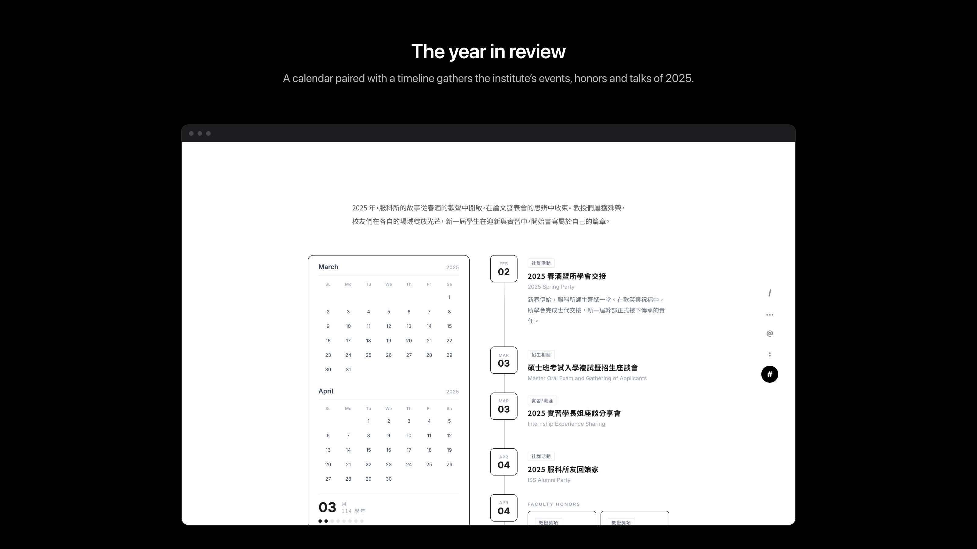
Between chapters, particle fields on black or white act as breathing spaces. In the faculty section, each professor’s message becomes a stack of retro window cards, with a low-poly 3D figure in the corner holding the punctuation mark that professor chose: a question mark, a tilde, an exclamation mark. The year in review pairs a calendar with a timeline of the institute’s 2025 events, honors and talks. The back cover closes on “to be continued,” bringing the cover elements back and stringing readers’ relay sentences into a single line.
Visual language
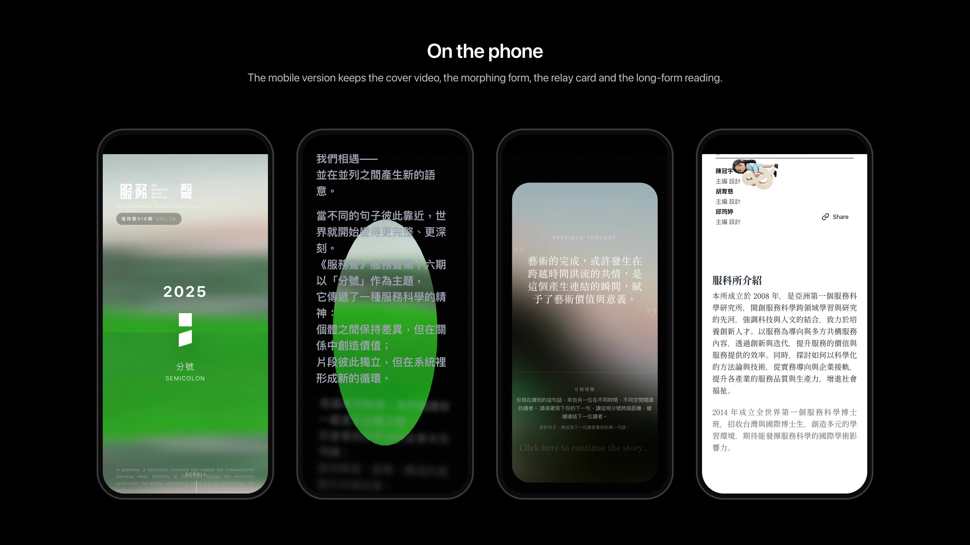
The issue is mostly black and white, and the green of the video is its only source of color: the cover, the texture of the form and the falling shapes all use the same footage of grass and sky, which gives the publication a consistent material feel. Chinese and English are set together, with vertical English against horizontal Chinese, bold sans-serif headlines and serif body text, to keep the reading quality of a printed journal. The mobile version keeps the cover video, the editor’s note and the relay interaction, with the navigation folded into a row of symbols.
My role
I was one of the three members of this issue’s editorial team, and I was responsible for the site’s concept, visual design and front-end development, from translating the semicolon into a reading structure to building every interaction. I hoped this annual issue would be more than a publication moved onto the web, and that continuation itself would become the reading experience, so that readers keep reading in continuation and leave their own semicolon behind.