Shaped by people, moving toward the world.
After twenty years, the Ministry of Education's Scholarship Program for Overseas Study in Arts and Design (SPOSAD) received a new identity in 2026. It was created by a cross-generational team of alumni from the 2006 to 2024 cohorts; I (2024 cohort) designed the logo mark.
A person stepping forward
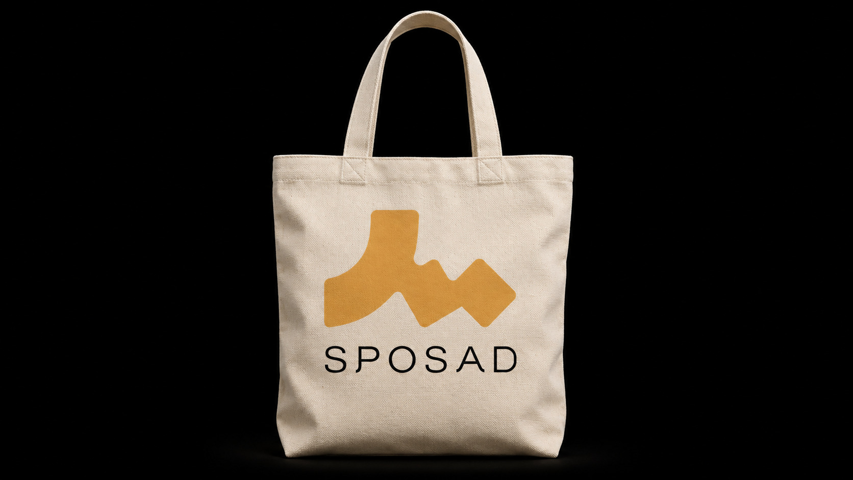
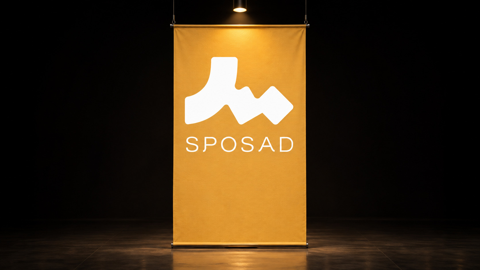
The mark is built on the Chinese character for "person" (人), reflecting a programme centred on its students. The triangle the character holds up is made of three elements, standing for the Ministry of Education, the international institutions and the fellows: through the cooperation of the ministry and its overseas partners, students receive support, resources and opportunities. Together, the three form the core relationship of the programme.
The blocks on the right continue the forward path of the character. They stand for fellows gradually gaining experience and building up energy until, at a certain point, they are pushed upward and onward to the next stage. That push echoes the support, resources and opportunities the programme provides, so participants don't stay where they started but keep growing and crossing boundaries.
Mustard yellow on a geometric grid
The mark is drawn on geometric proportions and a modular grid. Mustard yellow (#E3AE5D) is the primary colour, paired with standard black (#121212) and white, and the system extends into Chinese and English stacked and horizontal lockups for print, screens and exhibition spaces.