
2024 · 10Musashino Art University
[Musashino Art University] The art festival, and a concept called Trübe
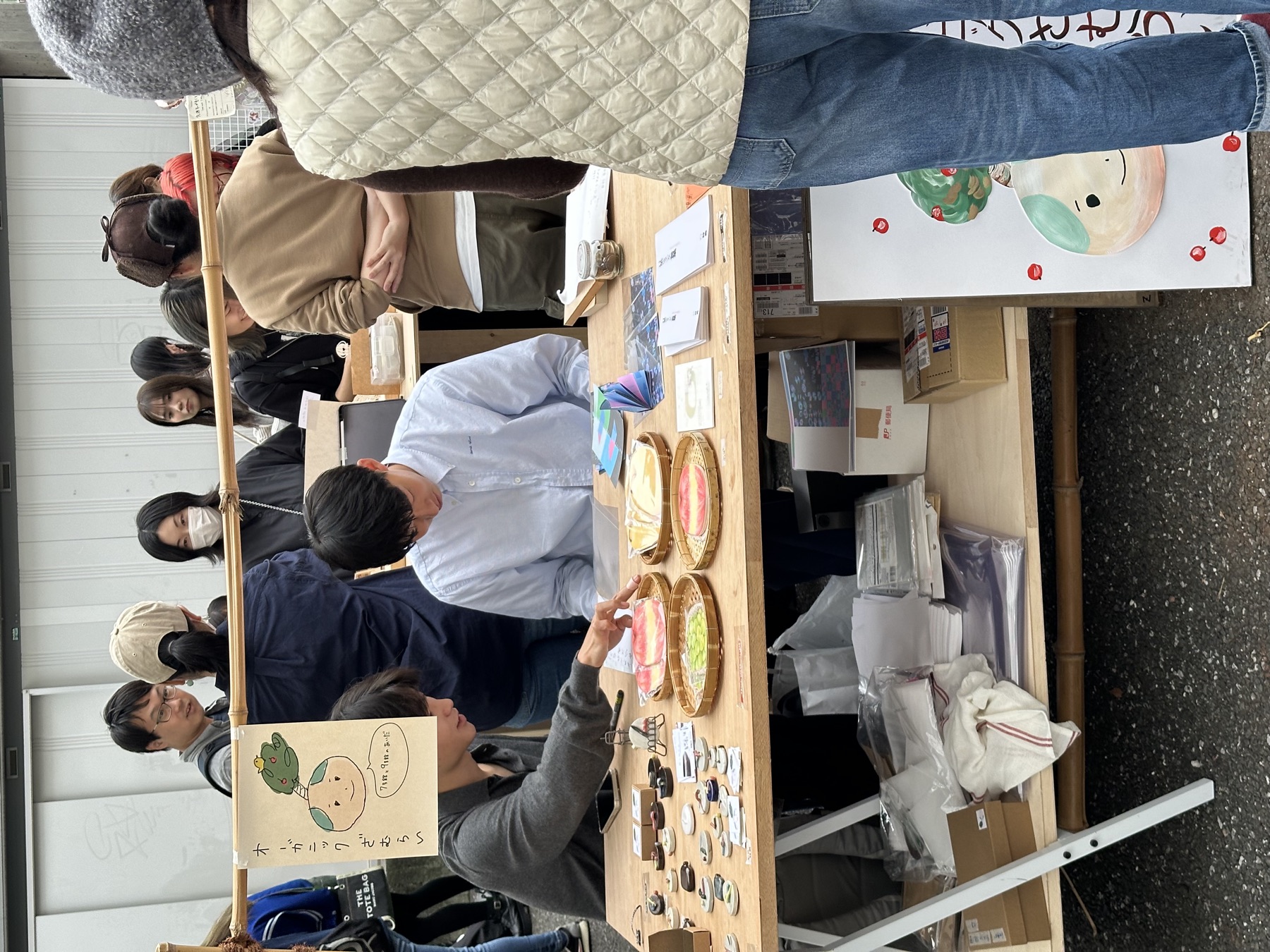
This month the weather in Japan officially turned to autumn. As the temperature dropped, the summer heat faded and was replaced by a crisp, pleasant coolness.
The art festival (芸術祭, geijutsusai) is a tradition held at Musashino Art University at the end of every October. I thought it would be like a school fair in Taiwan, but in person it was much bigger. There were close to 100 stalls selling food or handmade things, almost all set up by students or clubs. Besides the stalls, every department held its own exhibition, and there were all kinds of performances, a haunted house, a train and other rides, music and dance shows, and even a parade and a light show. It felt a bit like a Disneyland of art.
Because of the art festival the school gave us two weeks off. I used the break to see lots of exhibitions, get a Japanese driver's license, and go out to eat with friends from the Ministry of Education scholarship program who are also in Japan. It was a very full two weeks.
Seminar (Design Theory Practicum)
In this month's seminar discussions I continued exploring the theme for my own work. I currently have two directions: light and signatures. Over the past few weeks I've run experiments in different directions on both.
For "light," I took a new approach to the road-light color swatches I'd made before, drawing inspiration from reflections on the city's ground. I used wet paper to simulate slick pavement and collected the reflections, which looked like clouds.
For "signatures," I tried combining signatures with different concepts, such as Velcro, a garden, and even sound. The professor encouraged me to express my intent more clearly in the work, and to try more materials and tools to enrich its form, for example combining 3D printing and sound.
Time Axis Design
In Time Axis Design, the teacher quoted the idea that "tools transfer and change people" (道具が人間を転移する) to get us thinking about the role of tools in design. Tools don't just help us finish tasks; they change how we think and how we design.
In this course the teacher introduces us to new software. This time it was Cavalry, a program focused on 2D motion graphics. Like Figma it's a vector graphics tool, but it can also animate, so it can be used for logo animations and can even replace Illustrator for some tasks. Software this versatile lets us express design intent more flexibly in our visuals.
The teacher had us think about the relationship between tools and culture, showing how software and design tools shape a designer's creative process. Every tool has its own ways of being used and its own limits, and these deeply affect how designers express themselves, and even shape how we understand design. So the teacher's approach in this course is to have us get to know the characteristics of all kinds of tools, so we can choose the right technique more flexibly when we create.
The diagram on the right shows a more blended state. Here the boundary between the software tool and "what you want to do" merges, meaning tools and vision interact more closely, and the software can adapt more flexibly to support the user's creative goals.
In class the teacher used these diagrams to show how software tools can better support creative work: instead of being limited by a tool's features, the tool becomes part of realizing the idea.
The teacher also emphasized how to make work resonate with the audience, and gave us some points to think about how to use "resonance" to build an emotional connection:
- Movement makes things "easy to understand": movement in a work can help the audience understand it more intuitively.
- Movement reveals unexpected sides: through movement, a work can show details that are usually hard to notice, which makes it more interesting.
- Presenting something familiar in a new way is a little fun: seeing something familiar again can give the audience a subtle sense of humor.
- Resonance should be universal, not just appeal to a particular group: the goal is for more people to find it interesting, not only a specific circle.
- People look for a feeling of "release": a work should leave people feeling satisfied and relieved.
- Physicality and empathy: experiences like fear, humor, or inconvenience let the audience relate.
- Being "cool" is appealing too: let the work convey a distinctive style or character.
Graphic Design (Design Practicum IL: Graphic)
Trübe: the process of becoming between light and dark
In this class the teacher introduced the concept of "turbidity" (混濁, Trübe) from Shutaro Mukai's デザイン学 (Design Studies). It refers to the medium between light and dark, one of the processes by which color forms, and it emphasizes the following:
The nature of how color arises: color doesn't simply exist; it comes from the interplay of light and dark, and this dynamic exchange is what gives color its life.
The blending of nature and culture: design should reflect its environment and cultural background, showing a "sense of climate and place" and a "primal memory of becoming." This is a deep memory rooted in the interaction between people and their natural environment, and it comes through naturally in the creative process.
A worldview of dynamic becoming: design shouldn't be static; it is a process that gradually unfolds and keeps evolving as time and space change.
In the second half of the semester we'll develop designs from the concept of Trübe. My theme is "residual traces and the flow of time." I want to emphasize the relationship between time and objects, especially how objects become fleeting and unstable when they enter a turbid state, the state of "Trübe." The inspiration comes from residues in nature and daily life, like foam marks on the inside of a cup, or the foam left on the beach after a wave pulls back. These traces stand for the passing of time and show how matter changes over time.