
2024 · 11Musashino Art University
[Musashino Art University] Every version felt like the best one
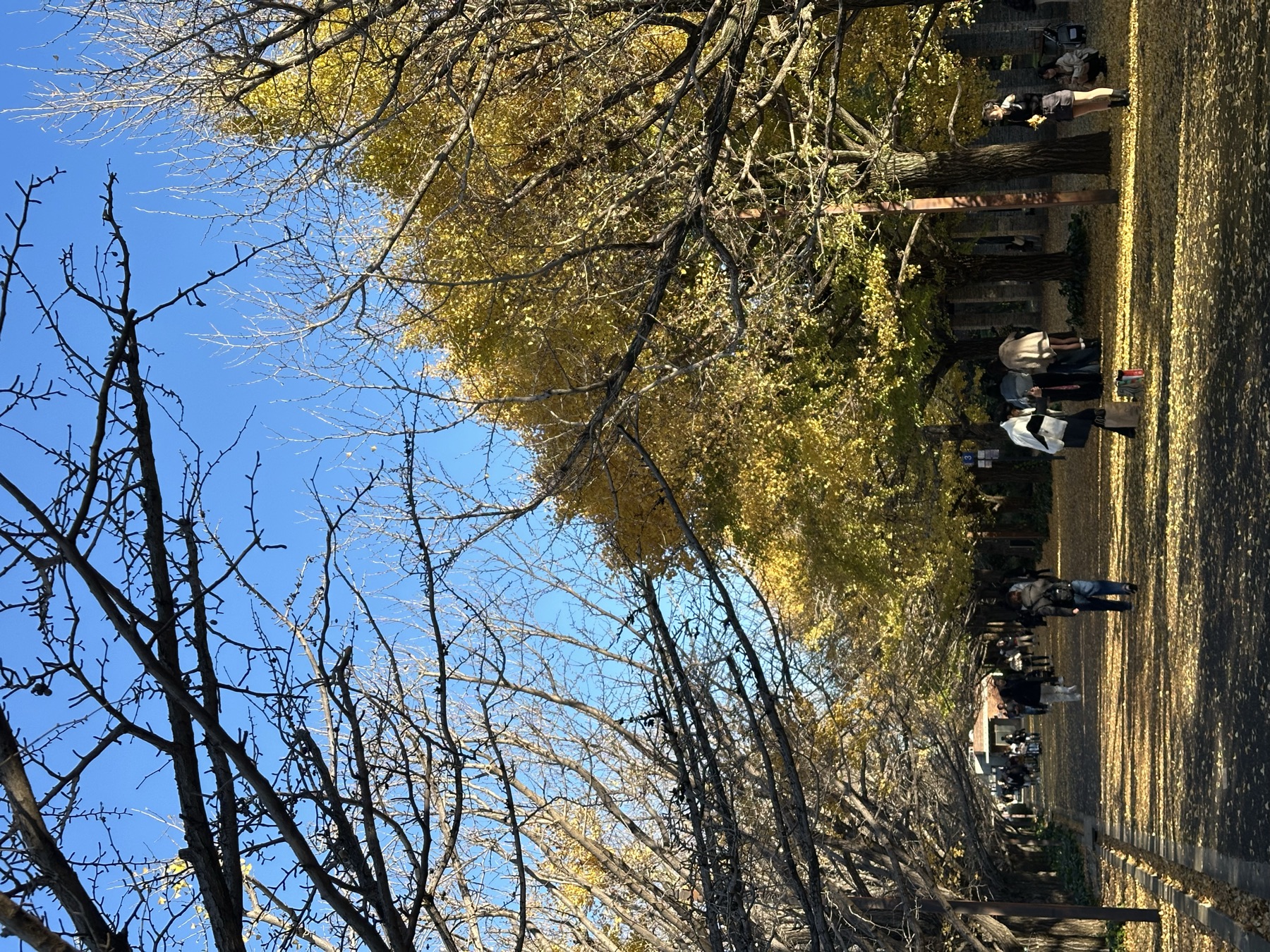
Autumn in Tokyo is very comfortable, around ten degrees, and the sun comes out more often than in Taipei, but it gets dark at 4:30 in the afternoon, which makes the days feel short. This is my third month in Japan. The first two months were about exploring and getting familiar with the society, the culture, and the school; this month I started to settle in more deeply. I'm getting used to the pace of my courses, and I've found more breakthroughs in my own work.
It gives you a sense of the season "right here, right now," and quietly becomes part of your everyday memories.
It made me wonder whether the peace we see and pursue is just a deliberately chosen point of view: looking at the world through "tinted glasses," hiding the suffering of places on the margins, turning a blind eye to inequality and violence in some countries, and pretending peace already exists.
Seminar (Design Theory Practicum)
This month I kept exploring the theme for my own work, the concept of "signatures," trying to combine signatures with different media such as sound and 3D printing. But during production I ran into limits in materials and technique, and the work hit a wall. The professor encouraged me to rethink the intent of the work and suggested trying more angles.
After that, taking inspiration from the sounds and light of the street, I started creating street color swatches that combine "light and sound." The swatches reflect the visual and sonic character of the city, conveying its rhythm and atmosphere. This new attempt was very well received by the professor; he thought the direction had a lot of potential and suggested I develop it further and strengthen its connection with the viewer. Finally, at the end of November in the seminar discussions, my own work moved out of the experimental stage, and I've now settled on a theme.
Time Axis Design (タイムアクシス‧デザイン)
In this course the teacher introduces a different concept every class. In one of them he raised the idea that "technology and expression need to be gentle." Design brings technology closer to human nature and reduces the sense of distance and alienation, rather than simply presenting cold functionality.
Gentle technology means building interactions into a design that feel natural and close to how people feel, so the technology itself doesn't stand out or feel stiff but instead helps people interact with it easily. A successful design, for example, lets users forget the technology is there and simply feel the convenience and comfort, which in turn sparks an emotional response. Examples: LOVOT and plush-toy computers, whose cute, fluffy look and human-like interactions lower people's resistance to technology and give it warmth. Or the Apple Watch feature that sends your heartbeat, turning heart-rate data into a tactile vibration and passing on a direct, intimate emotional connection.
Designing gentle technology needs to be handled strategically:
- Lower the learning cost: for example, GUIs (graphical user interfaces) use metaphors (like a trash can for delete) so users understand intuitively, lowering the barrier to learning.
- Simplify interactions: like Tinder's left and right swipes, which complete a complex choice with a natural gesture.
- Enhance emotional expression: for example, the Apple Watch heartbeat feature or iMessage's "invisible ink," which not only meet a functional need but also strengthen emotional exchange between people.
Why technology needs gentle design:
- Reduce fear: people are often afraid of unfamiliar technology, and gentle design makes it easier to accept.
- Broaden its reach: gentle design adapts to different cultural backgrounds and age groups, giving a friendlier experience.
- Long-term use: technology designed with warmth makes users come to rely on it, extending the life of the product.
Graphic Design (Design Practicum IL: Graphic)
This month in class we made two posters designed around the concept of Trübe, emphasizing the relationship between time and objects, especially how objects become fleeting and unstable when they enter a turbid state, the state of "Trübe." Foam is a brief and beautiful thing in nature. The little bits of foam left on the beach capture a moment of nature's constant change: they appear as the tide comes in and disappear as it goes out. They become witnesses to the sea and to time, silently telling how the tides and time are woven together. My theme is "residual traces and the flow of time." I made the posters with foam, trying to show the process of foam forming and disappearing, with the trace of time at the core of the design.
Design is also a process of "iteration." Chatting privately with the teacher, he asked whether I'd had similar courses at university in Taiwan. I said yes, but not as demanding as his: every class you have to print a new version of your poster and present it, revise it based on the feedback, then present again the next class, over and over. He said they see design as a dynamic process; only through constant feedback and discussion can a work be made as good as it can be, and that's what helps students improve. I couldn't agree more. Every time I finished a version I thought it was the best it could be, but with the teacher's suggestions I always kept improving it, and when I finally put the first version next to the last one, the difference really was visible to the naked eye.